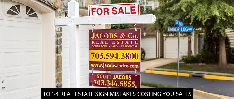
Top-4 Real Estate Sign Mistakes Costing You Sales

In today’s post, our real estate sign design experts run down some of the most common and costly mistakes we see in the Carrollton, Texas real estate market. Call 972-428-3200 for a real estate sign quote.
Mistake #1 — Relying On A Single Real Estate Sign
One sign is certainly better than none, but it’s definitely not optimal. In many cases, a single real estate sign simply won’t be enough to impress passersby and differentiate your offer from the competition, who may be using complete sign systems to create branded space and impactful indoor/outdoor displays.
Indeed, using one lonesome real estate sign often creates confusion, as readers are left with insufficient information and no clear indication of which home is actually for sale.
For best results, we recommend investing in complete real estate sign systems, comprising:
- Real estate sign posts—the classic H-frame stake or T-bar that holds a lightweight, corrugated plastic sign detailing your real estate opportunity and contact information.
- Vinyl decals—vinyl lettering, window graphics, wall decals, and sidewalk stickers work great for advertising the availability of commercial real estate and leading foot traffic towards open houses.
- Real estate flags—these are commonly used to advertise apartments and new constructions, meant to intrigue passersby and direct the eye towards more informational signs.
- Vehicle wraps and graphics—mobile real estate signs help get your message on the road, making the perfect “vehicle” for your branding.
- A-frame real estate signs—when you need a fast, durable, and replaceable real estate sign option to advertise your office or open house, A-frames can’t be beat!
Mistake #2 — (Bad) Location, Location, Location!
An unmarked home is an unsold home.
Though most realtors understand the importance of placing real estate signs directly on the property in question, we still see a surprising amount of sign location errors being made in Carrollton, Texas.
One of the most common location mistakes involves installing real estate signs behind seasonal or “fluid” obstructions, like parking spaces soon to fill or hedgerows ready to bloom. Remember that the quality of your real estate sign location might vary throughout the day, and you should try to anticipate these kinds of obstructions.
Mistake #3 — Undersized Real Estate Sign Fonts
Most real estate signs are viewed by passing motorists, which means you need to make fonts big enough to be legible from a moving vehicle. According to the International Sign Association, that means designing your real estate signs with letters a minimum of one-inch (1”) tall for every twenty-five feet (25’) of distance. This size makes your real estate signs legible for all legal drivers.
Of course, if you’re designing indoor real estate signs, you can get away with smaller fonts. But even then, bigger is often better. When in doubt, consult with our real estate sign experts.
Mistake #4 — Lack Of Real Estate Sign Consistency
It’s no use buying a real estate sign system if every part looks totally unique. Consistency and repetition are key for effective branding, so make sure you stick to your chosen color schemes, fonts, tone, and call-to-action, even when the sign type or content differs.
Free Real Estate Sign Design Quotes In Carrollton, Texas
Call 972-428-3200 or visit the SignCraft and Graphics website to book your free consultation online.
Back
