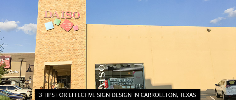
3 Tips For Effective Sign Design In Carrollton, Texas

Today’s post shares 3 fundamental tips for effective sign design, courtesy of our professional sign design experts in Carrollton, Texas. Read on or call 972-428-3200 to book a free sign design consultation with our team.
Emphasize Reading Ease In Sign Design
Most people give digital signage 1.5-4.6 seconds of attention before their minds flit away to something else. If your sign isn’t easy to read at-a-glance, you’ll squander this short window of opportunity and fail to make a meaningful impression.
If you aren’t a graphic design or copywriting pro, your best bet is to consult with a sign design specialist. If you’re in Carrollton, Texas, SignCraft and Graphics can help. But if you’d rather do it yourself, you might want to look into one of the various readability tools available online.
For example, you may wish to assess your sign design and copy using the Flesch-Kincaid Reading Ease test, which measures readability by word length, average number of syllables per word, and sentence length. This test is widely used by search engine optimization (SEO) software and plug-ins to help content writers clean up their copy, but it’s equally useful for punchy sign design.
Basically, the higher your copy scores on the Flesch Reading Ease test, the easier it is to read. If you score 90-100, for example, your sign is easily understood by an average 11-year old student. A score of 60-70 is easily understood by 13-15 year-old students, while 0-30 is best understood by university graduates.
You can increase your score by reducing word count, word complexity, and sentence length.
Save The Details For The Sale
Generally speaking, most signage is meant to impress and intrigue, not list every single value proposition and selling point. Trying to cram too much information onto a single signage is a recipe for disaster, a direct contradiction to our point on reading ease.
Unless you’re dealing with a very specific type of information signage (e.g. a sign describing safety protocols, product features, or COVID-19 business changes), dense blocks of texts are major turn-offs for viewers.
Use your signs to get people into the store, then let your sales representatives fill in the details.
Remember:
- High content for informational signage
- Medium content for interpretive signage
- Minimal content for impact signage
Leverage Visual Hierarchy For Impactful Sign Design
Visual hierarchy is the principle of arranging sign design elements to show their order of importance. For example, wayfinding signs need to emphasize the directional information, whereas promotional signs need to emphasize the sale value. Using color, fonts, letter size, and visual elements/structure, it’s possible to bring the most important information to the fore—and our sign design experts can help!
Book A Free Sign Design Consultation In Carrollton, Texas
SignCraft and Graphics proudly serves Carrollton, Texas and all the surrounding communities, including Highland Park, Las Colinas, Coppell, Addison, and Prestonwood.
Call 972-428-3200 or visit the SignCraft and Graphics website to book a free sign design consultation.
Back
