
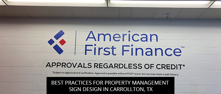
Best Practices For Property Management Sign Design In Carrollton, TX
If you want to enhance the performance of your property management signs, you’ve come to the right place. Read on to review research on proven design best practices, or call (972)-428-3200 to speak directly with a property management sign specialist in Carrollton, TX.
Research Review: Optimize Property Management Sign Legibility
- Optimize property management sign letter dimensions for better readability. In one study for the Center for Inclusive Design and Environmental Access (2010), researchers found that setting letter width equal to letter height results in greater legibility distances. If your property management signs must be legible at a significant distance, you may want to use these “boxy” letter dimensions.That said, the research team also found that different letter dimensions could achieve equivalent legibility distances when other “positive contrast” techniques were used. In other words, you shouldn’t feel limited to boxy letter dimensions, as our team has plenty of “positive contrast” techniques to make your design vision work.
- Tailor property management letter sizes to specific goals and audiences. Not all property management signs are built for the same purposes, but they should all be purpose-built.If your property management sign is intended to be read at “normal reading distances,” the authors of Typographic Design: Form and Communication recommend font sizes between 9-12, but that simply won’t do for signage meant to be viewed from roadside—on the contrary, here experts recommend designing signs with letters a minimum *of one-inch tall for every twenty-five feet of distance from the viewer. To determine the best font size for your specific needs, get in touch with our property management sign specialists.
- Make room for negative space. While you might be tempted to use every inch of your sign to “get what you paid for,” cluttered designs do not perform well. In a review of sign code design standards from different cities, John Bullough (2017) noted how most officials prohibited signage containing lettering on more than 75% of the sign face area, but even that is often too high to invite a quick read. To strike the perfect balance between positive and negative space, get in touch with our property sign design experts.
- Find the perfect display angle for property management signs. On-premise sign research by the United States Sign Council Foundation indicates that “reading performance begins to decline as the viewing angle changes from perpendicular with the sign surface to between 200 and 400 from perpendicular.” Accordingly, for best results, you should try to find a display area that keeps your message perpendicular to the viewer for the maximum amount of time. If you need assistance, you can book a free site survey with our team by calling (972)-428-3200.
Book A Free Property Management Sign Consultation In Carrollton, TX
To get a free quote on any property management sign project, you can:
- Call (972)-428-3200
- Fill out the quick contact form on our website
- Email info@signgraphicsandgraphics.com
- Drop by our commercial sign shop at 1313 Valwood Parkway, Suite 324, Carrollton, TX 75006
References
Bullough, J. (2017). Factors Affecting Sign Visibility, Conspicuity, and Legibility. Interdisciplinary Journal of Signage and Wayfinding, 1(2), 2-25.
Carter, R., Meggs, P. B., & Day, B. (2011). Typographic design: Form and communication. John Wiley & Sons.
Center for Inclusive Design and Environmental Access. (2010). Design Resources: Text Legibility and Readability of Large Format Signs in Buildings and Sites, DR-11. Buffalo, NY: University at Buffalo.
Garvey, P. (2006) On-premise signs: determination of parallel sign legibility and letter heights. Bristol, PA: United States Sign Council Foundation.
Back