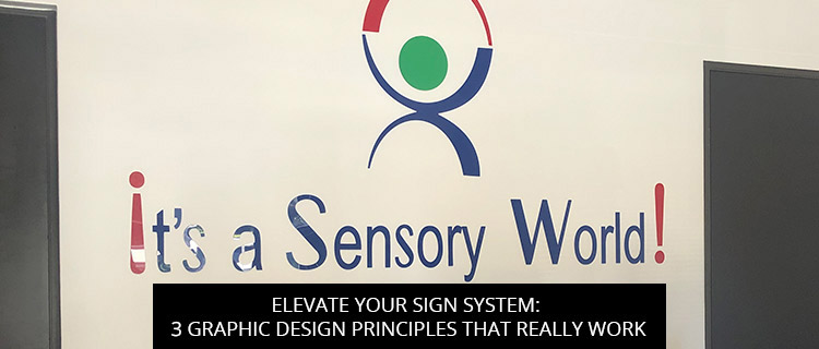
Elevate Your Sign System: 3 Graphic Design Principles That Really Work

Looking to elevate your sign system without upping your marketing spend? Buying bigger signs isn’t always the answer—sometimes investing in graphic design can yield more for less.
With that in mind, today’s post highlights 3 graphic design principles that you can use to make your signage system difficult to ignore and impossible to miss. Read on to learn more, or call (972)-428-3200 to start a free graphic design consultation in Carrollton, TX.
3 Graphic Design Principles That Really Work For Signs
1. Alignment: Put Audiences At Ease And Improve Sign Scannability
Alignment is about lining up texts and graphics to create structure, strengthen connections between different elements, and improve readability.
Just as you expect the text in this article to be organized into neat paragraphs, with consistent line spacing and sentences aligned to the left of the page, so too your audience expects sign layouts to follow certain rules. When these rules are not followed, or they’re absent entirely, reading your sign requires more cognitive effort, which can cost you meaningful impressions.
Clearly, proper alignment is paramount in the field of graphic design, allowing us to create clean, ordered layouts that satisfy reader expectations and make signage easier to scan at-a-glance. The latter is especially important, considering that most motorists only have 2 to 3 seconds to safely read signage.
If you feel like your signs aren’t performing as they should be, improper alignment could be the answer. Get in touch with our graphic design experts to learn more.
2. Visual Hierarchy: Make Your Most Important Message Stand Out
If your graphic design comprises multiple visual elements, it’s crucial that you create a clear visual hierarchy, finding ways to give extra weight to your most important information, whether that’s your brand name, call-to-action, or wayfinding information.
This is essential for fostering positive customer experiences, especially in wayfinding or informational applications, where readers don’t want to dig through a block of text to find what they need.
To make certain elements more prominent than others, you can enlarge keywords and phrases (e.g. your brand name), spell them out with distinct typeface, use color, or create a literal visual hierarchy, placing the most important message on the top of the sign, where the eye naturally starts scanning. For more help putting this graphic design principle to practice, get in touch with our team.
3. Contrast: Make Your Graphic Designs More Alluring
For whatever reason, the human eye is drawn to contrast. By cranking up the contrast in your graphic design, you make your message much more conspicuous and engaging, getting more eyes on your signs without having to pay extra ordering the next size up.
Color contrast is great (check out how we used the classic red-and-white combination to improve wayfinding at a local furniture shop!), but don’t stop there. You can also create contrast in other areas, pairing thin and thick lines, modern and traditional elements, and mixing fonts to draw the eyes of your target audience.
Put Graphic Design Theory To Practice: Free Sign Quotes In Carrollton, TX
If you live or work near Carrollton, Texas, our graphic designs aren’t hard to find. In fact, they’re all over town, popping up in coffee rooms, parking lots, trade shows, lobbies, and storefronts in Carrollton and all the surrounding communities, including:
- The Colony
- University Park
- Irving
- Prestonwood
- Los Colinas
- Coppell
- Dallas
- Addison, and beyond!
You can check out more of our graphic design results in our online gallery, or start a free consultation with our graphic design team by:
- Calling (972)-428-3200
- Requesting a consultation and quote online
- Emailing info@signcraftandgraphics.com
- Dropping by our shop at 1313 Valwood Parkway, Suite 324, Carrollton, TX, 75006

