
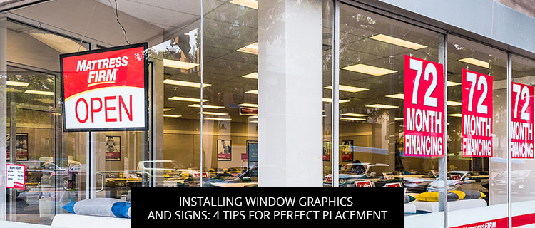
Installing Window Graphics And Signs: 4 Tips For Perfect Placement
Today’s post digs into peer-reviewed sign research to uncover 4 tips for perfect placement of any window graphics and signs. Read on or call our Carrollton sign experts at 972-428-3200 for help with site surveys, installation, and more.
Think About Intended Viewing Distances Early On
Viewing distance is one of the most important decisions you’ll make while installing window graphics and signs.
According to James Kellaris and Karen Machleit (2016), researchers at the Interdisciplinary Journal of Signage and Wayfinding, the distance of the sign from viewers influences “visibility, attention, recognition, legibility, and attendant processing of the information” (p. 6).
Accordingly, it’s important to have an idea of your intended viewing distance early on in the design process, since it will greatly influence your sign dimensions and font size. If you plan to advertise to passing drivers, experts at the International Sign Association recommend designing signs with letters at least 1” tall for every 25 feet of intended viewing distance. Window graphics and signs targeting pedestrians may be smaller, but bigger is often better.
Optimize The Angle Of Your Window Graphics And Signs
People will see your window graphics and signs best when they’re directly in front of them, but unless you want to block traffic, that’s not always an option.
When head-on advertising isn’t possible, do your best to optimize the viewing angle. In one study titled “Signage Legibility Distances as a Function of Observation Angle,” researchers described the optimal “visibility catchment area” (VCA) as a 5-to-20-degree cone, and concluded that all of the letters, words, and symbols on a sign should fall within a visual cone of at least 10 degrees for proper viewing and comprehension. Kellaris and Machleit (2016) also noted that signage viewed from low, upward-looking camera angles were perceived as “strong or potent,” whereas the same signs were seen as “Relatively weak and inferior when photographed from a high, downward-looking angle” (p. 7).
Space Out Your Window Graphics And Signs
Cramming your entire sign system into a small display area is generally accepted to be a mistake. This is partly explained by theories of visual complexity and grouping, which state that the increased visual workloads caused by clusters of sign symbols can have adverse effects on viewership (McDougall et al., 2006). Put simply, crowding all your window graphics and signs together overwhelms the viewer with a cascade of information, which more often than not convinces them your message isn’t worth their time.
Instead, take the “breadcrumbs” approach, leading them through your sign system piece by piece, step by step, with bite-sized messages and plenty of space in between.
Free Quote On Window Graphics And Signs In Carrollton, TX
Call 972-428-3200 to start a free consultation and get a quote on any custom window graphics and signs.
References
Kellaris, J. J., & Machleit, K. A. (2016). Signage as marketing communication: A conceptual model and research propositions. Interdisciplinary Journal of Signage and Wayfinding, 1(1).
McDougall, S., Tyrer, V., & Folkard, S. (2006). Searching for signs, symbols, and icons: Effects of time of day, visual complexity, and grouping. Journal of Experimental Psychology: Applied, 12(2), 118.
Back