
Logo Sign Design: 3 Data-Driven Tips For Better Branding In Carrollton, TX
![]()
To help Carrollton businesses brand better, today’s post shares 3 data-driven tips for better logo sign design. Read on or call (972)-428-3200 to speak directly with a logo sign designer near you.
1. Find Or Create A Distinct Font That Conveys Brand Character
Font selection is a major part of most logo sign designs, and for good reason. After all, most logo signs are limited to two components: the brand name and a simple graphic, be it an image, a border, or some other visual flourish. With the name of your company making up 50% or more of your sign design, your font really has to pull its weight.
But what’s best for your business? That depends on you, since every brand is unique, but we can help you find the perfect fit. Our logo sign designers will guide you through our catalog to find a font that conveys your brand’s unique character, whether you want a sophisticated script or something bold and simple.
You might also be tempted to create your own unique font. This strategy has paid dividends for some of the world’s biggest brands, with their fonts becoming instantly recognizable and distinctly associated with specific products and services. The fonts created for Disney, Yahoo, and Ferrari clearly illustrate this point—even when the colors and fonts are jumbled up, you’ll still have no problem telling which look goes with each company:
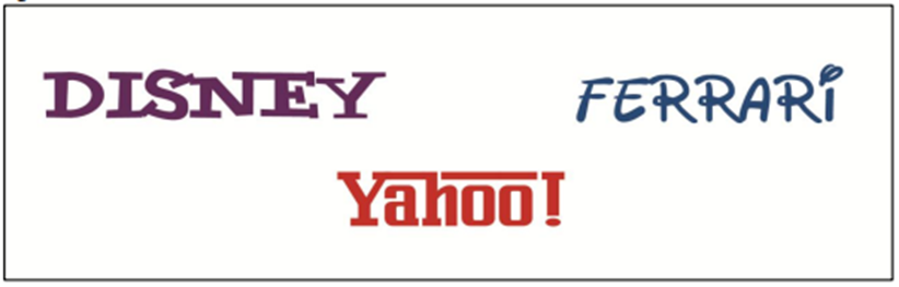
Can you match the font to the brand? If you want to create a distinct font for your logo sign, we can help.
If you want help creating a custom font, get in touch with our logo sign designers.
If you’re not ready for a consultation, don’t worry—we’ve gathered some data-driven font selection tips for you here:
- Minimal differences in legibility have been found between serif and non-serif fonts, so don’t get feel limited to one or the other
- Solid fonts work best—in one study, outline fonts needed to be 1.8-times larger than solid fonts to achieve equivalent legibility
- Garvey et al. (2016) ranked the following fonts as having the highest visual impact: Gill Sans Uppercase, Avenir Medium Uppercase, Copperplate Gothic Uppercase, Helvetica Uppercase, and Kabel Ultra Uppercase
- Garvey et al. (2016) ranked the following fonts as having the lowest visual impact: Old English Uppercase, Mistral Uppercase, Old English Lowercase, Brush Script Lowercase, and Mistral Lowercase.
- All uppercase typeface can make your message seem bold and commanding, but mixed case lettering is generally easier to read
2. Tap Into Color Psychology For Better Branding
In the words of the Color Marketing Group, “Color sells… and the right colors sell better” (Lambert, 2004, p. 77).
Color is king in advertising, allowing business owners to attract viewers, hold their attention, aid in memory, and evoke specific feelings and emotions with a single glance at their logo signs (Berman, 2007; Shank & LaGrace, 1990).
You probably already know some of the basic color associations you can use for branding (e.g. green for eco-friendly, natural, or organic brands), but did you know that you can target specific audiences with your choice of color?
It’s true! In one study, participants ages 13-20 overwhelmingly preferred dark shades of blue, in contrast to audiences 35 and older, who preferred lighter sky blue (Paul, 2002). In that same study, researchers note that young children were particularly open to novelty and experimentation with colors, as they responded extremely well to glitter, translucent, pearlescence, and metallics (Paul, 2002). Thus, if you want to appeal to older audiences, opt for lighter colors; if you want to appeal to younger audiences, look for dark colors; and if you’re marketing to kids, embrace novelty and have fun with your color selection.
To learn more about selecting colors for your specific demographic, get in touch with our logo sign designers.
3. Invest In Quality Materials And Printing
In a survey of 100,000 US consumers, 41.5% of respondents reported that they regularly made quality assumptions about businesses based on the look of their signs.
With this in mind, it is important that you invest in quality materials and printing for your logo sign design. Don’t worry—at SignCraft & Graphics, we only use high-quality materials and premium vinyl, and our cutting-edge large format printer produces stunning, high-resolution images in vivid color, so your brand will always look its best.
Schedule A Professional Logo Sign Design Consultation
Call (972)-428-3200 or request a consultation online to discuss your logo sign design needs and get a free quote on any custom order.
References
Bullough, J. (2017). Factors affecting sign visibility, conspicuity, and legibility: Review and annotated bibliography. Interdisciplinary Journal of Signage and Wayfinding, 1(2), 2-25.
Garvey, P. M., Eie, W. Y., & Klenna, M. J. (2016). The effect of font characteristics on large format display. Interdisciplinary Journal of Signage and Wayfinding, 1(1).
Gernsheimer, J. (2008). Designing logos: The process of creating symbols that endure. New York: Allworth Press
Lambert, J. (2004, September 13). Color schemers. Canadian Business, 77(18), 76-82.
Paul, P. (2002, February 1). Color by numbers. American Demographics, 30.
Shank, M. D., & LaGarce, R. (1990). Study: Color makes any message more effective. Marketing News, 24(16), 12.
Back