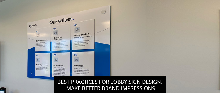
Best Practices For Lobby Sign Design: Make Better Brand Impressions

Want to take your lobby sign design up a notch? SignCraft and Graphics can help. Read on to learn 3 research-based best practices for lobby sign design, or call (972)-428-3200 to speak directly with a lobby sign specialist in Carrollton, Texas.
1. Keep Your Lobby Sign Design Simple And Bold
While complex designs are useful for signage with high “functionality,” such as product information signs and restaurant menu boards, when it comes to branding and basic wayfinding, it seems that simplicity is the ultimate sophistication.
Plenty of research bears out the value of simple lobby sign designs, with several studies showing how “less complex stimuli are generally easier to process, resulting in higher fluency” (Knuth et al., 2020, p. 8). Orth and Crouch (2014) found that “lower complexity enhances the perceived attractiveness” of products and brands; Eytam et al. (2017) found that simple lobby signs are “easiest to use,” placing less cognitive load on the viewer, and leaving more room for emotional connections to take hold.
So what’s the bottom line? If you want to make better brand impressions with your lobby signs, keep your design simple and bold, limiting yourself to 1-2 visual elements, and use evocative brand colors to say a lot with a little.
Create An Inclusive Business Space With Accessible Lobby Signs
In a 2017 study by the Interdisciplinary Journal of Signage and Wayfinding, titled “Accessible Wayfinding,” researchers discussed the importance of accessible lobby sign designs, noting their role in “guiding people through their physical environment and enhancing their understanding/experience of the space,” directing visitors to their next point of contact, and fostering a sense of inclusion for customers with visual impairment.
However, inaccessible lobby signs—those not designed in accordance with the 2010 ADA Standards for Accessible Design—had a host of negative impacts, creating “dysfunctional spaces” that left visitors feeling “confused and frustrated,” even those without visual impairments!
To make your business as accessible as possible, give all visitors the best possible experience, and avoid accessibility lawsuits, make sure your lobby sign design meets ADA standards. With SignCraft and Graphics, it’s easy—whether you’re modifying existing brand materials or starting fresh, our in-house graphics team will keep your design in-compliance every step of the way.
Reduce Visual Clutter To Improve Lobby Sign Effectiveness
In two new studies by the Interdisciplinary Journal of Signage and Wayfinding, researchers Jennifer Hong and Mathew Isaac found converging evidence that consumers evaluate signs more favorably when displayed by themselves than when displayed next to other signs.
Specifically, they found that signs displayed in low-clutter locations were judged to be “more aesthetic” and more engaging, whereas high-clutter locations were associated with lower engagement and greater cognitive burden.
With this in mind, we recommend installing lobby signs in low-clutter visual contexts, where your visitors’ eyes are naturally drawn towards it. That doesn’t mean you need to mount your lobby signs in an empty space, but if it’s not the only sign erected in the lobby, it should certainly be the most prominent. For more help with lobby sign site selection, get in touch with our team.
Free Quote On Lobby Sign Design And Manufacturing In Carrollton, TX
Call (972)-428-3200 or visit the SignCraft and Graphics website to book a free lobby sign consultation.
Back
